Monday 6 February 2012

I like how this image turned out on camera, I like the roughness and worn down texture of the wood and think it represents typography in a creative, interesting way.

Sunday 5 February 2012

The next project was Typography. For this I went around the college grounds looking for objects that resembled a letter of the alphabet. It was my aim to photograph the most interesting image possible. This image is one of the more obvious shots but I feel it works well.
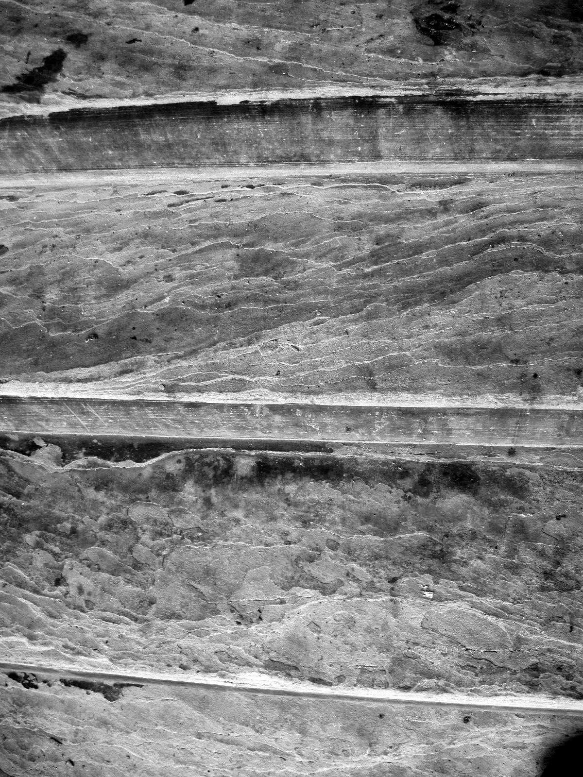
This image was taken of one of the stone walls of the Church. I chosen this wall because of the structure. Unlike the rest of the images which portray old, gritty textures, this image shows something much more smooth and sturdy looking. I think the angle in which I taken the photo from successfully creates a more interesting image.
This image is again of a stone pillar. I especially like how the pattern turned out on camera.
I believe this image is a strong portrayal of shape and form due to the lines running horizontally across the wood as well as the rigid looking texture.
This image was taken of a stone pillar. I decided to take the photo at this particular angle to emphasise the pattern on the stone running right the way around both edges.